Daniel Kao
Web designer and developer for businesses that need a stronger first impression.
I make websites feel sharper, clearer, and easier to trust.
If the business is solid but the site looks dated, cluttered, or weak on mobile, that gap costs trust fast. I redesign the pages that matter so customers understand the business quicker and take action with less friction.
Mobile-first
Pages rebuilt to scan cleanly on phones
Clearer action
Calls, bookings, and quote paths stay visible
Stronger trust
The site feels credible before anyone contacts you
If this sounds familiar
Many sites already have the right information. It just is not being presented clearly.
The business is good, but the site looks behind.
That mismatch lowers trust before anyone reads the copy or reaches out.
Mobile visitors have to work too hard.
Important actions disappear into long pages, weak hierarchy, or awkward navigation.
Everything is technically there, but nothing feels clear.
The site has the right ingredients, just not the structure or presentation to make them land.
What I improve
Not a generic refresh. A clearer business-facing website.
Most of the time, the issue is not that the site needs more stuff. It already has what it needs. The problem is that the layout feels messy, the hierarchy is weak, and the important actions are harder to find than they should be.
Best fit for local businesses like barbershops, restaurants, florists, and service brands that already do solid work but need a stronger online presence.
First-screen clarity
The opening section should explain the business fast, show quality, and point people toward the next step immediately.
Service-page cleanup
People should understand what you offer without digging through clutter, weak copy, or generic section stacks.
Inquiry flow
Calls, forms, bookings, and location details need to feel easy to reach instead of buried in the layout.
Before
Dated look, weak structure, unclear next step
After
Sharper positioning, calmer layout, easier action
Sample work
Work that shows how a stronger first impression changes the whole site.

Barbershop Concept Redesign
Gentleman's Parlour
A premium barbershop concept focused on stronger mobile booking, better hierarchy, and a cleaner first impression.
View project

Florist Concept Redesign
Eden's Florist
A florist concept redesign focused on cleaner category flow, stronger trust cues, and faster same-day ordering on mobile.
View project
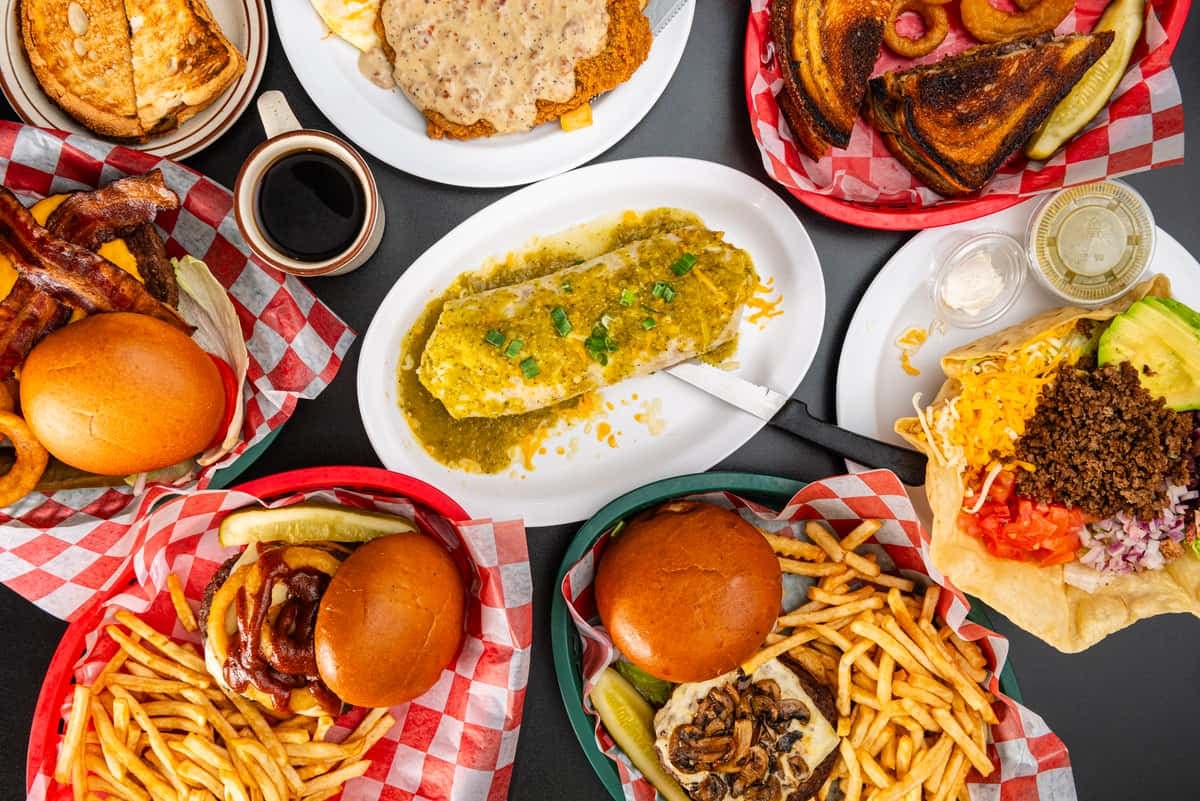
Diner Concept Redesign
Pacific Diner
A diner redesign that keeps the real food photography but rebuilds the site around stronger menu flow, local credibility, and easier mobile action.
View project
Process
Straightforward work. No vague “brand refresh” language.
The process stays tight. Find the weak spots, redesign the screens that matter, and ship something that feels materially stronger instead of just more polished.
01
Audit what feels weak
I look at the parts killing confidence: dated visuals, bad mobile flow, unclear service structure, or weak calls to action.
02
Rebuild the key screens
The redesign focuses on hierarchy, spacing, copy framing, and a clearer route to inquiries or bookings.
03
Ship something useful
The result is not just prettier. It is easier to trust, easier to navigate, and easier for customers to act on.
Contact
Need a website that feels sharper, clearer, and easier to trust?
Send your business type, current site, and the main problem you want fixed. I'll reply with fit, scope, and the next step.
Best for
Businesses that already do solid work but need a stronger first impression, cleaner mobile flow, or a site that is easier to trust.
Project form